Who knows how many times you have thought: why should I choose dark tones to furnish my home? There are many reasons. By searching here and there, you have surely read that darker colours give an elegant and sophisticated touch to the room, that they adapt better to contemporary settings, and that they are capable of enveloping and enhancing the spaces, making the geometries of the entire house emerge in a decisive way. A home with dark tones may therefore be the right choice, but with a few precautionary measures.
WHEN TO CHOOSE CERTAIN COLOURS
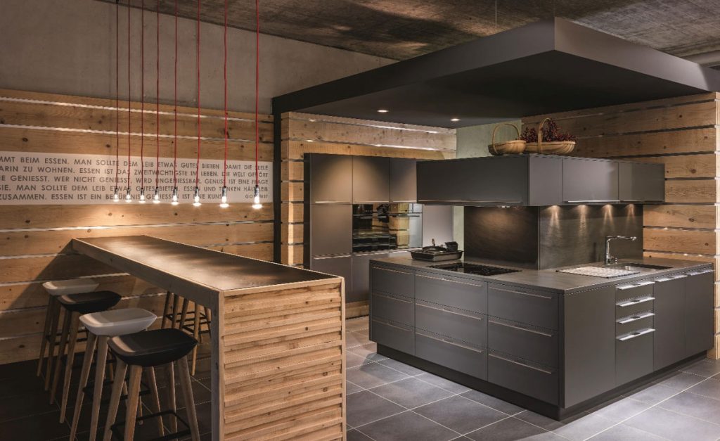
One of the first aspects to consider if you choose to furnish a home with dark tones is definitely the surface area. Very spacious houses and apartments with an underground taste or country setting in which wood is the main feature go perfectly well with this type of colour choice. An example? The industrial style SM Quartz – Wave Vulcano kitchen.
The dark hues can create a sense of elegance and sophistication, indeed creating special solutions. However, with small or poorly lit spaces, the risk of creating a very closed-in space may have an adverse effect, decreasing value to the setting. And light, both natural and artificial, can play a decisive role in a home with dark tones. If you have large windows and skylights, with particularly suitable sun exposure, opting for certain types of colours could be a winner. Another tip is not to ‘overload’ the spaces too much with dark colours. Alternating with a touch of white here and there could enhance them even more.
COLOURS
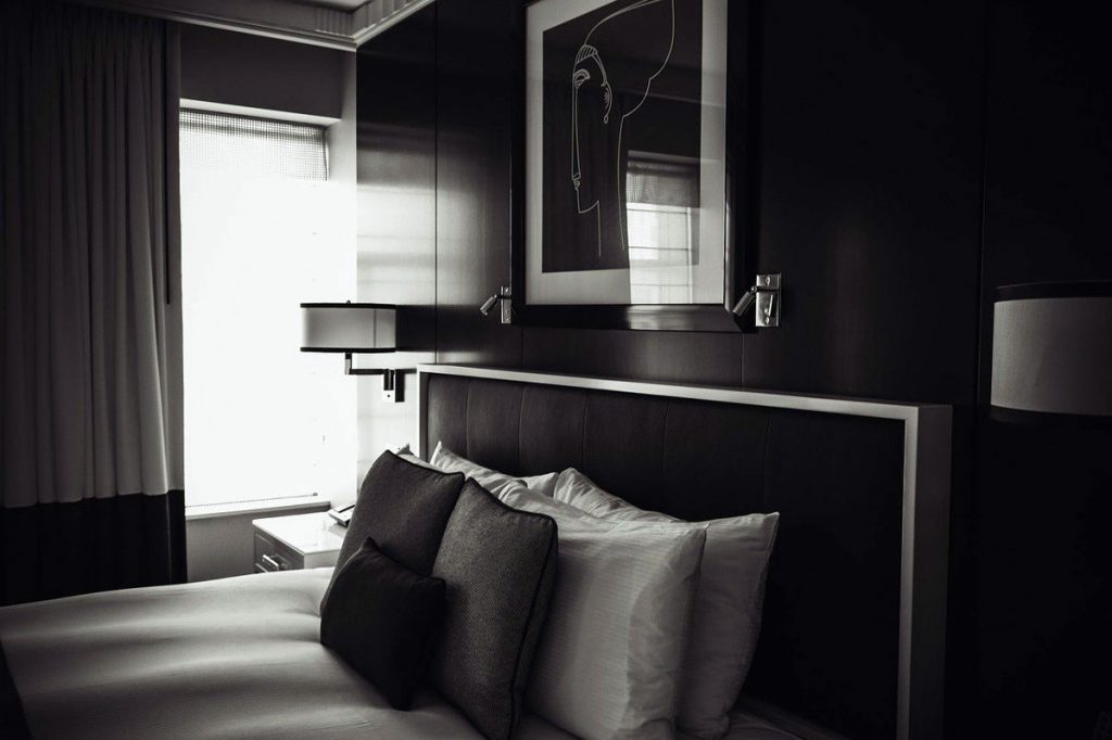
The black and dark grey hues give a minimal touch to the spaces, making them more intense. However, you must be careful not to create a very dark atmosphere; therefore, opt for a simple wall and just a few pieces of furniture at most. On the other hand, lighter tones have an effect of making the room more relaxing. In this sense, great attention must be paid to the sources of light: an interesting tip is to avoid putting up curtains at the windows so as not to hinder the distribution of light. Another perfect solution is to install stand-up lights. Lastly, grey blends very well with pink and may be perfect in the choice of patterns for the tiles, whereas the choice of installing it in the kitchen makes the room more sophisticated. Instead, we shall opt for black to give a strong connotation to the room. With regard to blue, the colour of the sea, you must choose it if you want relaxing and reassuring spaces, perhaps blending it with neutral tones or ivory for a stylish solution that always remains trendy. Purple shades, from plum to violet, are more elegant colours: they work if you choose complementary colours for the accessories or furnishings. Lastly, brown: not always appreciated by everyone, it can give warmth and tranquillity to homes with very essential settings. It goes perfectly well with gold-coloured accessories and home decor, such as a beautiful picture frame.
FURNISHING
Furnishing is precisely what gives added value in a home with dark tones. The choice of sofa, a painting, a picture frame or a simple desk may be decisive if you decide to include them in a dark setting. An aspect not to be underestimated if your home considers these types of solutions.