“Colour in architecture is just as powerful as the layout and the cut”.
“Is furnishing with colour possible? Painting walls or playing with furniture? What are the rules and precautions to be taken into account to avoid mistakes?
In addition to affecting space perception, each colour is linked to a personal reaction that evokes memories and triggers feelings of well-being to a greater or lesser extent. Choosing appropriate colours is, therefore, crucial in architecture and furnishing, especially for the effects they generate in those who live in the environments. Colour must be selected wisely by relying on professionals, no doubt about that. Without getting intimidated, let us try to delve into the complex world of colour and leave, at least for the time being, the safe harbour of “neutral tones” as the only solution to avoid getting tired of furnishings and walls over time.
Whether you want to opt for “neutral shades” or “dare with colour”, this short and certainly not exhaustive article is not meant to be a guide, but just provide food for thought in the fun, complex “colourful” world – namely on furnishing with colour.
Where should you start?
At the onset: a little history.
Have you ever heard of “Architectural Polychromy”?
These two terms define the instrument designed by one of the fathers of twentieth century architecture, the master Le Corbusier who, in 1931 and 1959, created two colour palettes divided into 63 shades. The first 43 consist of solid colours and graded lightenings, with evocative names such as space, sky, velvet and sand, and the other 20 more intense and marked shades, range from the brightest nuances through to earth tones, up to the deepest black. Naturally harmonised shades that can be combined in any way. Le Corbusier thought that each had its own significance and embodied specific spatial and human effects. He was certain that each of us had a conscious or unconscious penchant towards certain colours, and he urged everyone to get to know themselves in depth, through their own colours. Trying to figure out which colours belong to us and which ones do not, and, by entrusting ourselves to a professional, harmoniously mixing shades – is precisely the way that Le Corbusier’s chromatic keyboards could be used nowadays.
Chromotherapy
Over time, the study of colours and the effects they generate on individuals have evolved into several scientific theories, up to chromotherapy, according to which each colour has so much power over our minds as to influence our tempers and moods. Each room and/or area of the house is combined with colours that directly produce effects on us. Yellow, red, green, blue, orange, purple and pink are among the colours that can stimulate creativity and optimism, relax us, reduce anxiety and stress, convey hospitality and even stimulate appetite! Choosing one colour over another in a room can really make a difference. Rely on an expert, therefore, if you want your home to be in line with the principles of chromotherapy.
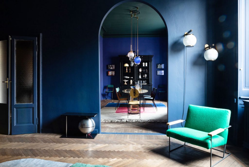
Classic Blue
Although following trends is not always the right solution, an exception can certainly be made in my opinion for the Pantone colour of the year. We are now used to eagerly waiting with anticipation for the historic company to dictate the standards in terms of colour to the whole world. The Pantone colour for 2020 is Classic Blue, an elegant, simple colour, a deep shade that draws inspiration from the sky at dawn, bringer of peace and calm. A penetrating colour if used as a chromatic addition to the walls, it can also be used for interior decoration, adding character and a modern twist. It is perfect for creating contrasts with white and neutral colours; think of a beautiful sofa in this colour on a light background, it becomes a catalyst for attention, so as to create immediate focus in a room. It is perfect in combinations with all the different types of wood; it also goes very well with marbles and camel and caramel colours. And what about lovers of contrasts like me? Combined with bright greens or deep red accents, it generates interesting solutions.
Key word HARMONY Choosing the right colours for a flat is an art that requires balance and extensive study. Several factors come into play in an interior design project, from the historical legacy of the location through to the needs of light and space management, to properly matching a certain design accessory that should rightly be highlighted.
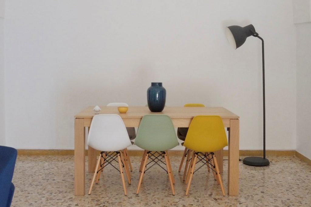
There are no right or wrong colours. There are appropriate colours for a specific project, a certain room, those specific people; home furnishing goes beyond all fashions and times, and should probably reflect the personality of the house’s inhabitants. To furnish in a harmonious and aesthetically successful way, a solution could be choosing a main colour and mixing it with colours that are chromatically close to it, e.g. by associating sapphire, blue and indigo, or pink, fuchsia and red, or forest green, English green and sage green, that is more desaturated and cooler. The important thing is to make the most of each one and use the brighter one for details. As a matter of fact, some good advice could be using no more than three colours: a main colour for large surfaces; a secondary shade for fabrics and curtains, and finally a third nuance to be used to create focus and add dynamism to the setting. Finding the right colour combination is crucial.
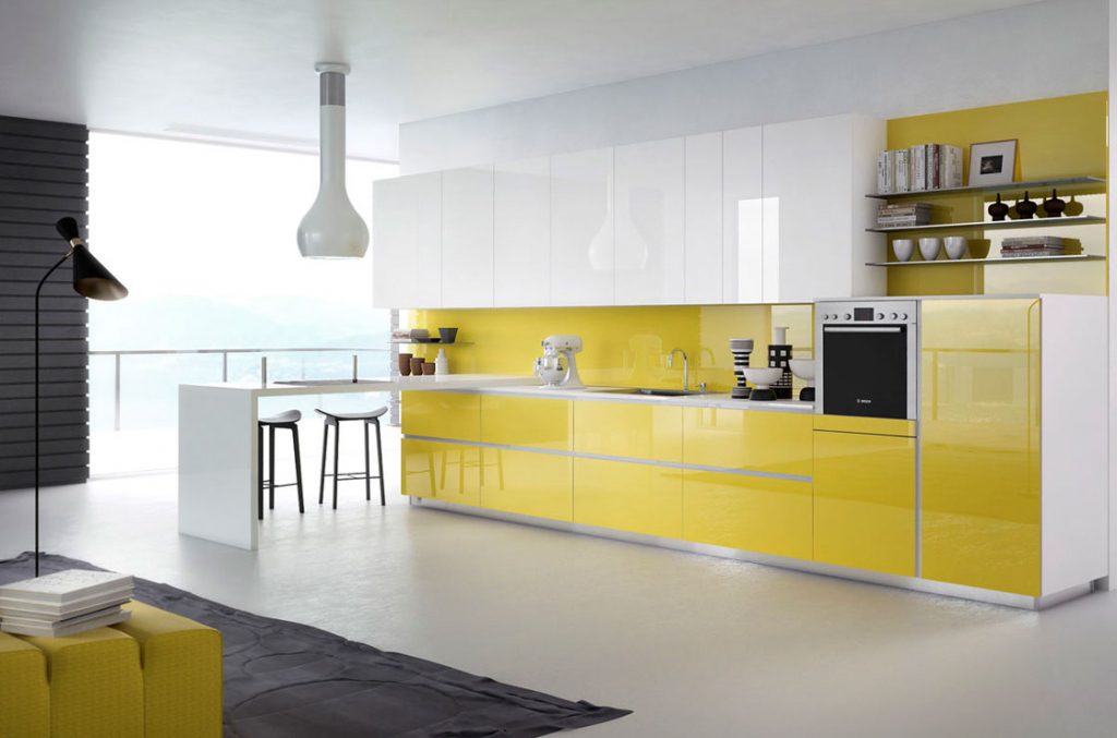
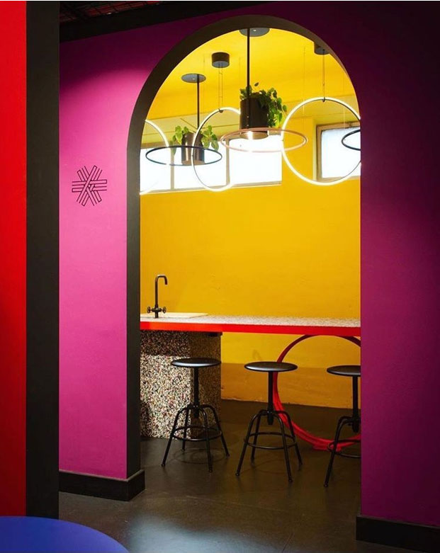
Complementary colours and contrasts.
If we refer to the well-known Itten’s circle, it will be easy to identify complementary colours, in contrast with each other. They are located on the outer disc of the circle, in opposite positions. Furnishing a home with contrasts is a trend that is becoming increasingly popular. Start with yellow if you want to bring warmth to the living area, e.g. with a kitchen with wall units in this colour, or use it in the living room. The complementary colour of yellow is purple. It will be perfect in these rooms: have you ever thought of a purple sofa with yellow cushions?
Despite loving colours, many people prefer soft colours to strong ones. A useful tip could be to play with the chiaroscuro technique, or to choose colours located side by side in the chromatic circle, which can help us create very pleasant contrasts without exceeding with colours. Using desaturated green as the dominant colour, a winning combination could be with ochre and pink, or pink and hints of purple. One of my favourite combinations, however, is sage green associated with blue nuances, with accents of teal blue; cool, relaxing but energising and classy at the same time.
Bronze, gold and wood
The warm colours dominating furnishing in 2020 have certainly not gone unnoticed. The trend has been to wisely combine bronze with teal, forest green or burgundy, bright gold with apricot hues, using bold greys and intense black for details. Combinations for those who want to dare with warm colours and love to emphasise elegance with class.
Personally, I do not like abounding with colour. I always maintain the “less is more” rule for elegance. The pure white that dilates the gaze and illuminates rooms is definitely my favourite predominant colour, to be combined with intense contrasts or chiaroscuro, but this rule cannot be valid for anyone. As you have certainly noticed, each project is unique and consists of several factors and variants. The colours we use should evoke and arouse emotions and, above all, talk about ourselves. That is perhaps the only way we can give up the idea of using just neutral, basic colours, out of fear that we may get tired of colour over time.
Architect Angela Di Giorgio
Sitography
Photo 1
Lago Elements catalogue 2019
Photo 2
PalermoUno photo
https://gucki.it/en/art-design-en/an-apartment-in-milan-becomes-a-design-gallery/
Photo 3
Instagram profile @vibeisbright
Photo 4
https://www.pianetadesign.it/curiosita/laccato-o-laminato-lucido.php
Photo 5
Author’s photo