By the time I turned 40, I had spent my life dressed in black, with the odd foray into grey, brown and tan. Then I discovered that life was better in colour. In fact, everything was better in colour!
The truth is that this is a realisation to which one arrives with time. They say that this time is adulthood, the time of awareness, and I fully agree!
After all, opting for colour entails making an effort with combinations, it entails daring; perhaps one needs to feel secure enough to look at other possibilities and leave one’s comfort zone.
The same thing happened in the houses in which I’ve lived: the house of my 20s (the age of recklessness) was a riot of colours that made no sense, thrown haphazardly together. The house of my 30s (the age of uncertainty) was monotonous. I lived convinced that everything had better be monochromatic, thinking that I could use this is a reason to be daring with accents… I was lying to myself, as all my accents were inevitably neutral, because that would give me free hand to choose colourful accessories… And so on and so forth. It was a house worthy of the cover of a glossy magazine. I had done my homework and had coordinated everything, but without a spark, without personality. Did I like it? At the time, I thought it was the best way to decorate a house. I thought that balance was to be found in calm, but I was wrong! The house of my 40s? A different kettle of fish…
At 40, a red lipstick on my pale face lit a fire under my feet: the desire to transgress. It didn’t take much for me to finally realise that colour changed my mood, was able to change my thoughts and herd them towards heightened emotions.
Our houses are, inevitably, an expression of ourselves: they tell our story. And that’s why it’s important to see them. This is the reason I often turn down online consultations: to change something of yours, I must know you. No one colour will be perfect for everybody – that would be a non-choice. Colour can bring harmony, tranquillity, excitement. Each shade harkens back to different characteristics, which, unconsciously, you choose based on who you really are.
What characteristics may those be?
White is energy and candour, cleanliness and order. It is the colour of sticklers for precision, of people who have very well-defined ideas and who change them with difficulty. It represents a deliberate and conscious choice. My advice is to incorporate wooden furniture and to combine white with all neutral shades with the addition of hyper-colourful wall art and vintage mirrors.
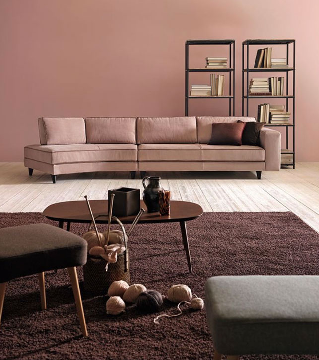
Pink is gentleness itself. It’s a calm, elegant colour that relaxes the nervous system. I like to advise people to use it in the rooms where they rest, not necessarily in the bedroom.
Purple is the colour of mystery. Purple velvets are exquisite! Often linked to spirituality and magic, it’s perfect for creating a bohemian atmosphere with retro touches.
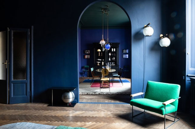
Blue is the cool colour par excellence, but it’s perfect for the bedroom! Long live blue, the colour of peace and harmony, that can lower blood pressure and breathing, a colour that can be combined with a myriad other colours… Can you tell I’ve started loving it?
Yellow is the colour of creativity, of people who are always in search of stimulation. They say that it’s linked to the left side of our brain, the side that reigns supreme over imagination. That’s why it’s thought to help concentration. I discourage people from using it in bedrooms, but it’s perfect for warm day rooms and for studies.
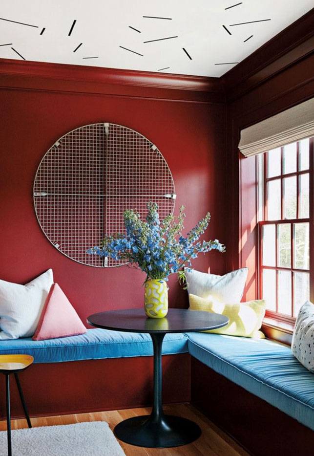
Orange is the colour of extroversion. It fills the space with energy and can change people’s mood. It’s a powerful, rarely used colour that’s perfect for day rooms. I particularly adore it in accents and combined with green. Let’s talk about red: it’s a commonplace that it’s the colour of passion, true as that may be. It’s also the colour of excitement and should be used in moderation, especially in small spaces. Its brighter shades could make sensitive people nervous.
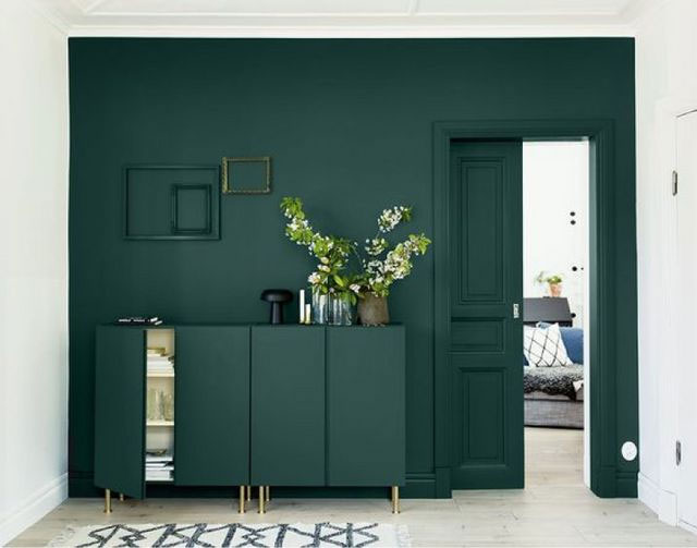
Green: if you’re sincere, open and gracious, this is the colour for you! Green is vitality; it’s the colour of nature, a fresh breath, the colour of people who like to stand out but not be the centre of attention… I dream of a world made of houses with small green corners: it is of little importance if they are plants or a simple wall colour.
Brown is the colour of keeping your feet firmly on the ground! It’s typically associated with people with strong personalities, with people who are aware of their duties and who can fulfil their responsibilities. In a few words, people who don’t change their mind easily!
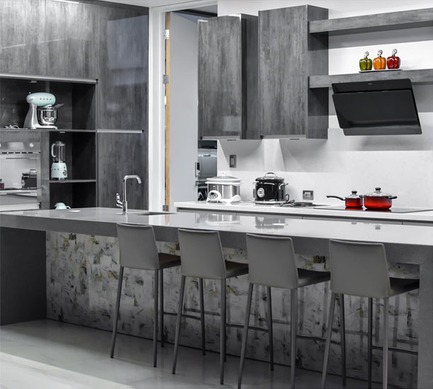
What about grey? I see grey as the colour of compromise! It’s perfect for the prudent, people who would like a colour, are unable to pick one and go for the happy medium. It’s typical of passionate people who are burning to act but hide it all behind a calm exterior. However, it’s an elegant and sophisticated colour and is suitable for any room in the house; in its lighter shades it can replace white.
Black: black is necessarily linked to power, to people who want to prove that they are sure of themselves. This may be a strange statement, coming from someone who dressed in black for the first 40 years of her life, but I don’t really love this colour in the house: I find it too final, too transgressive, too forceful.
These are the colours: characteristics that do a fine job of describing who we are and how we feel. That’s no mean feat and I’m not just talking of the effect of painting and textiles. Nowadays, there are coverings that can impart a powerful personality to your spaces, such as the Santamargherita agglomerates: how to mix them. combine them and dose them is the main mission of the people who take care of your houses. A mission that comes with great responsibility… I should know!
Cristina Giorgi @Spaziometodo