Which facing you should choose to add a stylish touch to the kitchen
One of the cosiest, most used and important rooms in our homes is undoubtedly the kitchen, which is why it is important to give it the right style. It is a place for entertaining and, when thinking of the act of cooking, it is also one of the most creative and experimental rooms. Hence the kitchen is not just a place where people gather and talk, but it is also a place for creation that is increasingly important for the people who “inhabit” it.
Creativity in the kitchen is not just about cooking, it also applies to materials, furniture and design. Choices in terms of style and design to do with spaces and surfaces affect the creation of certain ambiances. As certain colours and furnishings change, so does the ambiance of a room and its effect on mood.
Today I will deal with the surface finishes you should choose to add a stylish touch to your kitchen and I will talk about the quartz surfaces by Santamargherita, a Verona based company that produces agglomerates for works and homes all over the world.
Santamargherita quartz agglomerates are suitable for finishing the kitchen area. These rooms are particularly subject to little everyday accidents (perhaps not so little when there are children in our homes!). In addition to excellent aesthetic performance, quartz also has high technical properties. It is resistant to scratching and acids. These are all essential features, especially for supporting surfaces. If the material is unsuitable or poor quality, permanent damage to the chosen surface finish is unfortunately frequent. Agglomerates have the advantage of withstanding the strain of everyday life, without having to forgo the timeless beauty of stone.
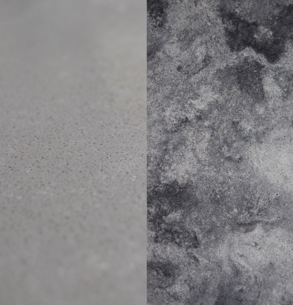
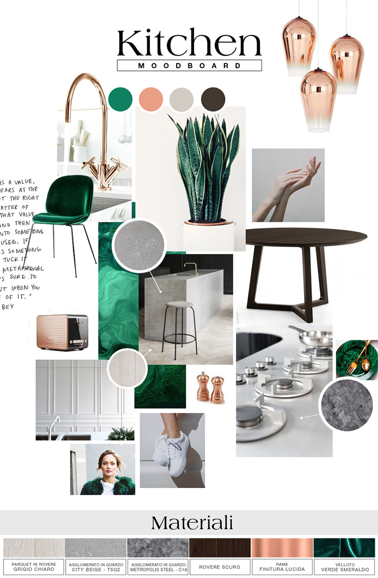
To create a kitchen area worthy of its name, always start from something that inspires you. To give you a better idea of what I mean by “add a stylish touch with surfaces”, I have created an inspirational mood-board by using two of my favourite Santamargherita colours: City Beige (T5Q3) and Metropolis Steel (C16).
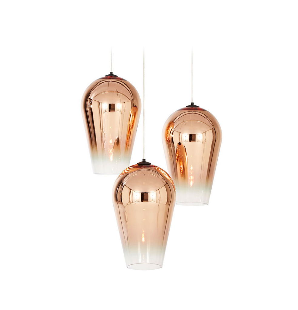
I created an elegant and sophisticated setting for you. An envelope, a shell with muted hues fading to shades of grey, from lightest to darkest, with two luxury materials that embody and enhance the setting: quartz agglomerate and oak wooden flooring. A refined, essential container that lights up with contrasting touches. Emerald green and copper are other key colours in the colour palette I chose to give the right touch to the room. The light design moulds and reveals shapes and colours. In this case, the pendant lighting with polished finish seal the informal feel of this elegant setting.
When designing an environment with muted hues, it’s important to enhance its appeal with purposeful and well thought out accents. That spark lends a customised feel and gives a kitchen – and, in general, a space – its unique personality.
CREDIT FOTO:
tomdixon.com (lighting Fade Pendant)
gubi.com (seat Beetle Chair)
poliform.it (kitchen table)
pinterest.com
Camilla Bellini