When designing an environment or restyling for a customer, I always start by choosing colours and coating. They are the two unquestionable starting points I use to establish the mood of a room and its end use.
If colours help me create the right atmosphere, coating is functional to the environment so needs pondered considerations in the first work preparation stages. I could say that colours are “the heart” and coating “the mind”.
Through my projects I always think about the end user. When the job is done, the customer must find him/herself in a recognisable environment, becoming an oasis of wellness and serenity. This search has become a lot more important again in recent years. The “new luxury” is use of timeless details to make a home inviting and welcoming. A cared for place in which to enjoy small daily pleasures. So let’s leave room for sophisticated, elegant coverings revisited in a modern key; using carefully selected , certified materials to guarantee an excellent performance. My favourites are undoubtedly wood and quartz and marble surfaces. “Eternal” materials that always top the list of what’s desired and guarantee lasting, top level performance. The Santamargherita Quartz line (SM Quartz) offers a wide choice of colours, textures and innovative finishes, fully customisable; perfect to give an environment the right character and make it one’s “own”. And the Marble line (Sm Marble) once again proposes the timeless taste of natural marble in a modern key; in different colours and grains, mixed wisely to give any type of environment that touch of elegance.
The harmony between “heart” and “mind” becomes the key defining everything coming next: choice of furniture, lighting, accessories and details.
My mood boards, created before I start a new project, mix all these elements and give the customer a general idea of what the end result will be like.
The first mood board is created for the kitchen in an urban loft , lived in by a photographer who mainly works with food styling, often from home.
The customer’s request is simple: divide the kitchen area ideally and turn it into a photographic “set” for her free-lance jobs.
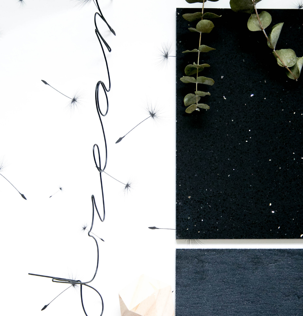
As we are dealing with a loft, an open space area with no structural divisions separating environments, I decided to give the kitchen environment so dear to my customer a touch “of the dramatic”. For the work top in this space, I designed a “Volcano”, quartz coating from the Santamargherita Weave line, a velvety type collection inspired by the most precious natural slates. The surface features waves and sinuous ripples with no specific layout. A prefect background for bringing out the colours of food and enhancing the contrast. This line is highly stain and abrasion-resistant, so ideal used in kitchens.
To cover the walls, I decided to use another quartz coating, “Nero stardust”. This time, however, with a shiny finish containing tiny points of light making the texture dynamic and precious
Obtained from selected quartz sands and resins certified for contact with food and resistant to bending, abrasion and acids.
These two coatings juxtaposed create a perfect industrial look for the urban loft of my young customer. Their dark colour defines the kitchen space and separates it from the rest of the home. For what concerns style details, I suggested a simple, minimal wallpaper, on a white background with delicate black dandelion fuzz, to be used in a niche or defining the breakfast corner. An element providing that right balance of lightness and relaxing the eyes. Then we need the “breakage” element: that unusual detail I like adding to my projects. In this case, small touches of natural wood which, contrasted with the quartz coating, create an unusual, unexpected earthy game. This industrial mood is then highlighted by the simple metal string of lights and accessories like the candle-holder in grey stone and the black and white geometric pattern of fabrics.
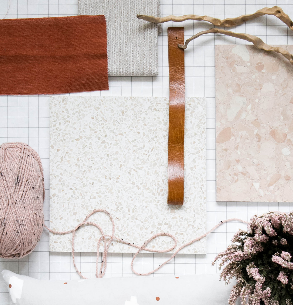
The second mood board is for the kitchen of a b&b in the hills. In this large environment, the owner organises cooking lessons for foreign guests and runs a knitting club once a week.
The request is to have a luminous, welcoming space, including more traditional details but reinterpreted in a modern, contemporary key. Together with a large food preparation area, the space has to hold a small relaxation corner with vintage family armchairs for the knitting club meetings.
As the kitchen is partly ready, I concentrated on the floor and decided to create a geometrical pattern using marble this time.
For most of the floor area, I chose the marble “London”, belonging to the Santamargherita ‘900 Line and inspired by the Venetian terrace from the beginning of last century. The material, originally in cement with marble grit, is re-introduced in a marble-resin mix, with higher technical characteristics making it ideal for use in high traffic areas, like the kitchen in this b&b. Easy laying and simple maintenance are two fundamental features I am sure the customer will appreciate.
Moreover, the surfaces of this line are made with a high percentage of recycled material, with minimum environmental impact . This makes it perfect for obtaining LEED credits.
The colour I chose, with small pink touches, combines perfectly with the existing wooden kitchen; to be repainted light grey for a more refined, yet traditional finish.
To give even more importance to the new central island characterising the large environment and heart of the cooking lessons, I chose the marble “Rosa Perlino” to still have the same dusty rose shades, but more intense. This coating will be used to define this large island using a geometrical, interlocking game and will also be used as a “frame” for the entire environment.
The palette chosen starts from these two marble coats, both containing delicate shades of pink. They will be flanked by a very light, desaturated grey for the kitchen and an intense brick chosen for the vintage armchairs. This palette is then joined by small leather details for the kitchen handles. To amplify luminosity and give the environment character.
As you can see from these two mood boards, the coating choice is undoubtedly very important to characterise an environment and establish a room’s personality.
Choosing the right shade, the right material and the right mix of furnishings, lighting points, accessories and details makes the difference in the end result.
Opting for dark colours gives space depth {contrary to the idea that they make it smaller}. Using quartz and marble in these shades is a winning solution creating a certain emphasis and drama. For example, the “Nero Portoro” and “Grigio Carnico” marbles, thanks to their characteristic white, grey and reddish veins (in the first case}, are intense but lightened by these casual patterns, giving the environment a certain dynamism.
For the opposite result, you need to choose less defined patterns, for example “Maui” or “Calais” quartz.
To create light and highlight a space’s grandeur {whether commercial or private}, it is better to choose light colours, playing with contrasts and perhaps creating frames and geometrical games to identify spaces. Possibilities are just about infinite if you count all the laying variables {as found in the second mood board} and by choosing to request customised colours that characterise even further.
A trend seen increasingly more in specialised magazines and interior projects published in magazines all over the world is the use of marble and quartz that recall terraces. Whether it be the large grain of, for example, the marble “Arabescato Bianco” or the narrower grain in the marble “New York”, this type of coating is increasingly more popular for its versatility and adaptability to different home environments. A classic returning to the scene in a new, modern way, in a marble and resin agglomerate mix.
I am convinced that a search is needed to make a space elegant and timeless. And that search starts by choosing lasting, top quality products and coverings. Following instinct helps identify one’s personal mood and give that unique touch turning a simple house into a real “home”.
Ilaria Chiaratti