How many times have I heard that the Nordic style is cold, minimal and impersonal?
As often happens, people stop at the stereotypes which wants it all white (and black, when a color is added!) and empty. As Nordic style lover I can safely say that there is no more wrong and superficial statement.
The Nordic style is not just minimal and empty spaces and white and black; there are many facets, nuances that make it always interesting and fresh {and I think this is the great strength of this style}. My version for example is delicate, made of pastel tones, design pieces approached to cheaper objects, diy which are flanked by my hand-made work. The balance that I try to maintain is based precisely on the correct dosage of all these “souls”, without one prevailing too much on the other, like so many notes of the same melody. And balance is just one of the characteristics of this style: balance of colors, shapes and patterns. To which we add the light, fulcrum in all seasons: in summer the natural one and in winter the warm and enveloping one of candles and lamps placed in strategic places for a relaxed and cozy atmosphere.
The colors are the unexpected side because as I said there is no defined palette, ranging from pastel colors to those decided and in contrast with each other {look for example the wonderful patterns of Svenskt Tenn}, to the darker and more material. This aspect, so varied and eclectic, is also present in the materials, wood in primis that we often find from the floor to the ceiling, and then marble and quartz, which make the spaces more sophisticated and elegant. I imagined two different palettes, one that plays with pastel and soft tones and one with bold colors and materials in the foreground.
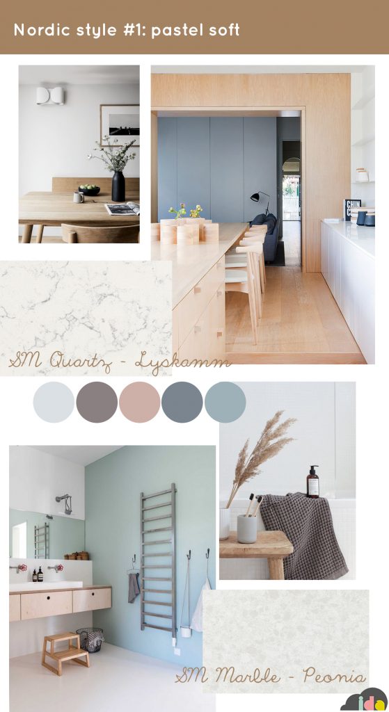
In the first one, the palette is delicate and natural, with extensive use of wood and details that recall nature, a great must for Nordic style. The colors are blurred and never too sharp, ranging from an optical white to a pale pink that becomes almost plum, up to a range of dusty and delicate blues. And they are in perfect harmony with the materials of the coverings: wood in fact, but also the SM Quartz – Lyskamm for the kitchen top and the SM Marble – Peonia for the bathroom floor, chosen in light tones that illuminate the space and reflect the light. The environments are the quintessence of harmony, everything is in balance and the space is relaxed and calm.
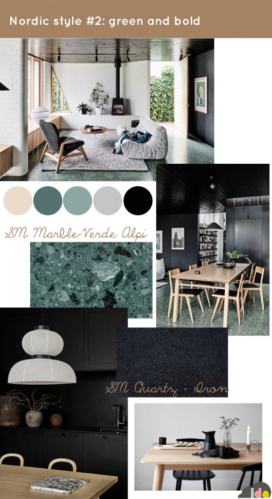
The second palette is instead bold and string; here too great importance is given to wood, a connecting element in all the Nordic style, so strongly linked to nature and open spaces. The colors of nature are the trait d’union of this palette, characterized by cold but intense colors. The forest green of the SM Marble – Verde Alpi and the black of the SM Quartz – Iron chosen for the surfaces perfectly match the wood and the lighter and brighter details. And when it comes to dark colors, Nordic style teaches us how they actually help make the spaces look larger, thanks to an optical illusion that makes them more deep. You don’t have to decide which one do you prefer, the Nordic style is fluid and “interchangeable”, its elements can easily adapt to any situation and any room. For this reason it is a style that has great success, it is an evergreen that thanks to its sophisticated and balanced elegance will never go out of fashion!
Ilaria Chiaratti