For over two years, one of the colour trends that continues to impress and enchant us is that of tone-on-tone, a special effect in which walls, furnishings, accessories and fabrics of the same shade never contrast each other, thereby creating a refined, soft and harmonious look. Simple, isn’t it?
Creating a look like this can actually be more complicated than it seems: it doesn’t take much to err and make the room boring and visually flat.
In fact, simply buying a can of paint and thoughtlessly covering every wall in the house does not suffice: like every technique, tone-on-tone also has its golden rules and secrets.
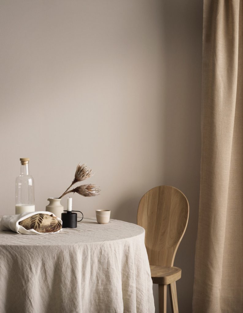
One of the secrets to make it work lies in fashioning a palette of colours based on a main tone to which other graduated tones in the same chromatic shades are added to create a sort of “chameleon effect”, while none of the elements disappears into the background. Just like the photo shown here, where we can see how the different shades of beige connect with each other despite their different intensities:
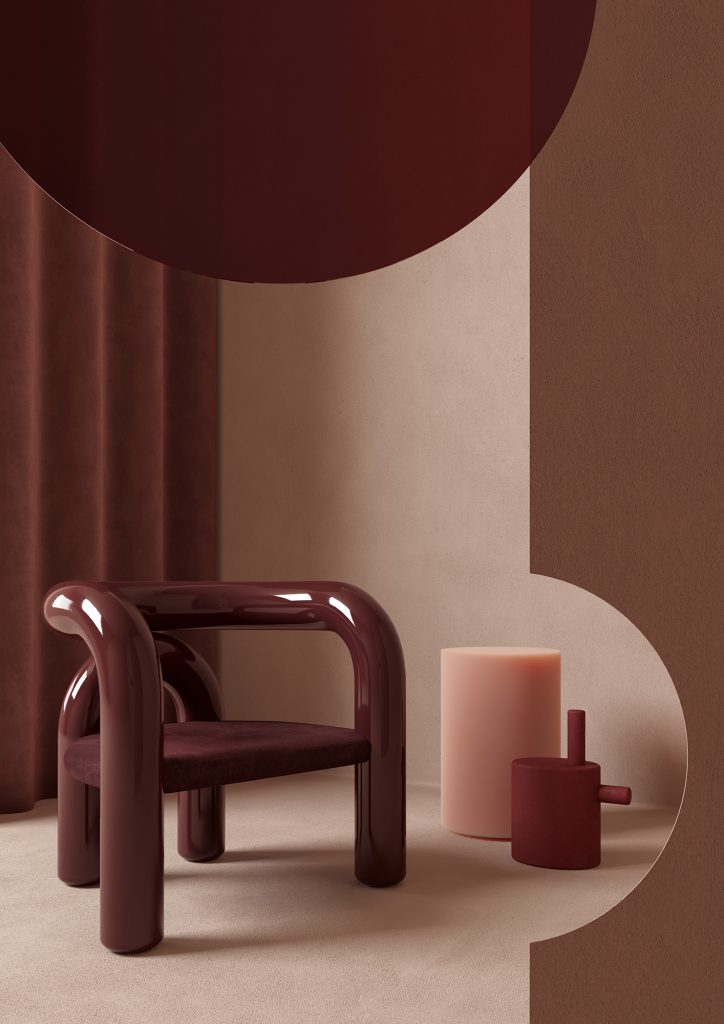
Playing with the layers of different textures is another trick to maintain movement and variety within the space: in this way, the different materials with their light and dark tones and their more or less reflective surfaces have the power to create the illusion of a new colour while keeping a harmonious colour scheme
Here is another example of a mixture of textures all in shades of anthracite grey: the padded velvet sofa with its luminous reflections blends with the soft texture of the walls and floor, in contrast with the ruffled linen curtains in the same colour, creating movement that gives the space a three-dimensional effect.
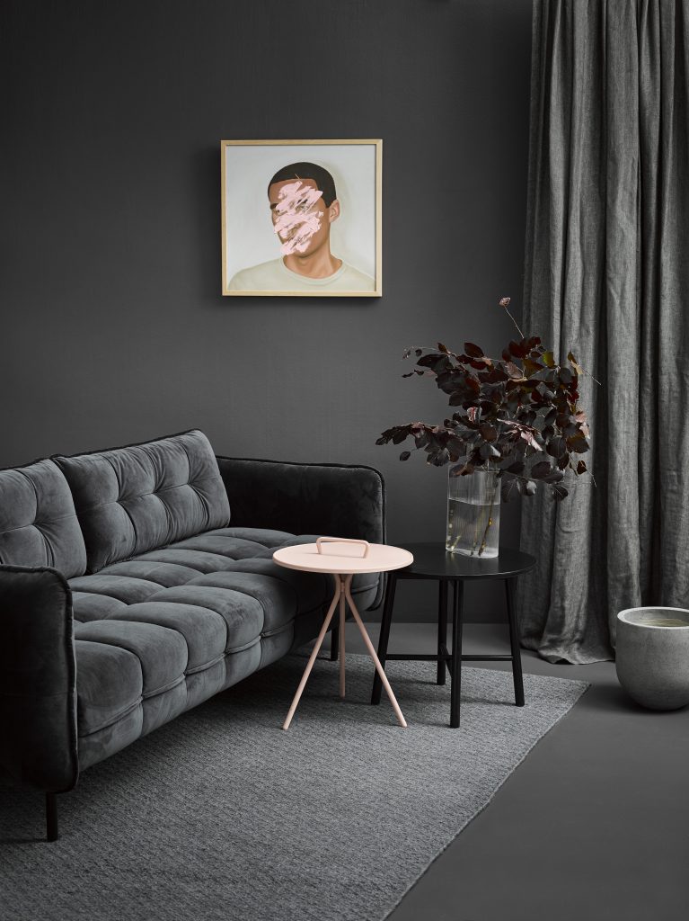
However, here – as opposed to the other photos – to create an additional attraction point, an item (or rather two!) has been added in total contrast with the masculine quality of this shade of grey: the delicate pale pink of the table and the picture on the wall.
A perfect way to “break” the continuity and create excitement and interest in styling.
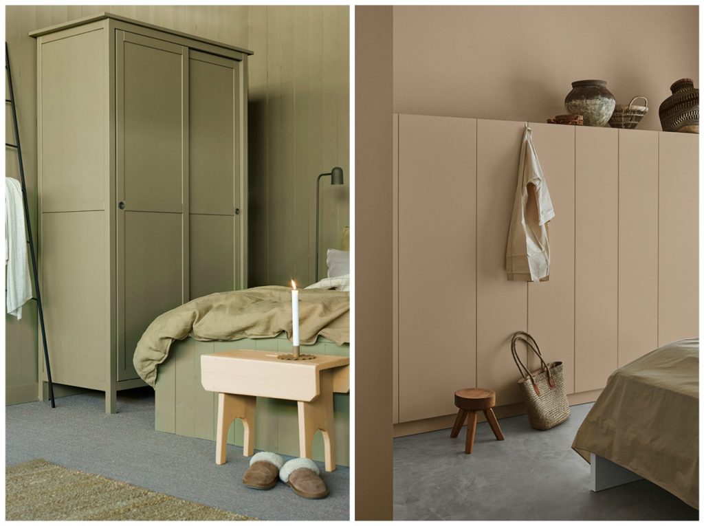
If, however, the aim is to make a piece of furniture “disappear” – possibly because it is visually voluminous like wardrobes usually are – go for tone-on-tone: the room will look bigger and the wardrobe smaller:
What do you think? Will you ever have the courage to recreate this effect in your home?
La Tazzina Blu